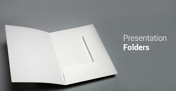
Tips For Using A Presentation Folder
Whether you’re presenting material in a team meeting or workshop, or pitching your business in a conference, a folder can elevate your presentation. Presentation folders promote your brand and effectively deliver a message – and they can also drive traffic to your online platform. You can provide compelling content for your meeting, conference or workshop with a standard or complex design.

Presentations shouldn’t be dry. Check out the following tips on how to use a presentation folder creatively to engage your audience.
Stay on brand
Your presentation folder should be customized to fit the brand of you or your company, especially if you’re pitching your products or services. If you’re just presenting a project or idea, these rules still apply. The content’s tone should clearly match that of you or your company’s, and the colour scheme and visual aspects should be complementary. Ultimately, you want your folder to drive home your message and your company’s brand. As well, using the same colour scheme as your company, or using photos, will help to optimize your folder.
Keep it simple
Simplicity is crucial. Too much information can be overwhelming and your message can get lost. Your content and visuals should have some breathing room so they can stand out individually. Keeping things concise will help the reader to better understand the material, while also appreciating the design. If you overcrowd each page with multiple photos and large chunks of text, you’ll lose the interest of your audience. Each piece of content and each visual should serve a purpose, and getting straight to the point will help to drive home your message.
Target your reader
Your presentation folder should target your audience. Whether you’re presenting a project or idea, or pitching your company, knowing your target reader will help you to better create your folder and ultimately intrigue your reader. As well, you should ensure the content and visual tone of the folder matches up to that of your target reader, such as a more professional, or casual, feel.
Be cohesive
Information presented at the very beginning of your folder should follow through straight to the end. A misleading or confusing presentation folder will lose the reader’s information.
Keeping these tips in mind, as well as ensuring a visually appealing design and using high quality stock, will help you to achieve your objective. We specialize in commercial printing and our presentation folders elevate your meeting with a professional and elegant appeal. Interested in adding direct mail marketing to your advertising mix? Please call our Toronto mailing house at 1-866-486-0423. Troi spells success, one letter at a time!
About: Seamus Barton
Seamus Barton joined Troi Mailing Services in 2014 after graduating from York University with a Bachelor’s Degree in Professional Writing. As a manager of print and direct mail solutions, he sees how words play an important role in personalizing any experience. Seamus’ passion for writing motivates him to provide frequent direct marketing content that supports each Client’s individual needs. Please chat with Seamus about commercial printing and direct mailing campaigns, or about how to marry digital and physical strategies for optimal Smartmail Marketing success.
You can connect with Seamus on LinkedIn or by calling Troi Mailing Services at 1-866-486-0423 or via email at seamus@troimail.com. Read his latest article featured in Direct Marketing Magazine on “Dimensional Mail: Marketing’s Buffet Lobster“
- How Local Flyer Printing Can Amplify Your Neighbourhood Marketing Efforts
- Bulk Printing Services: Affordable Solutions for Large-Scale Marketing Campaigns
- How Promotional Posters and Printing Drive Event and Brand Success
- The Power of Custom Marketing Materials: Building a Memorable Brand Identity
- 5 Common Direct Mail Mistakes and How to Avoid Them
- Brochures
- Direct Mail Campaign
- Direct Mail Flyer
- Direct Mail Marketing
- Direct Mailing
- Direct Marketing
- Drone Delivery
- Email Marketing
- Flyer
- Fulfillment Services
- General Category
- Graphic Design Trends
- Industry & Culture
- Lettershop
- Magazine Marketing
- Mail Campaign
- Mailing Service
- Marketing
- Mortgage Companies
- Omnichannel Marketing
- Postcard Marketing
- Presentation Folder
- Print Campaign
- Restaurant Marketing
- Variable Imaging


Leave a Comment